From Betaboard to
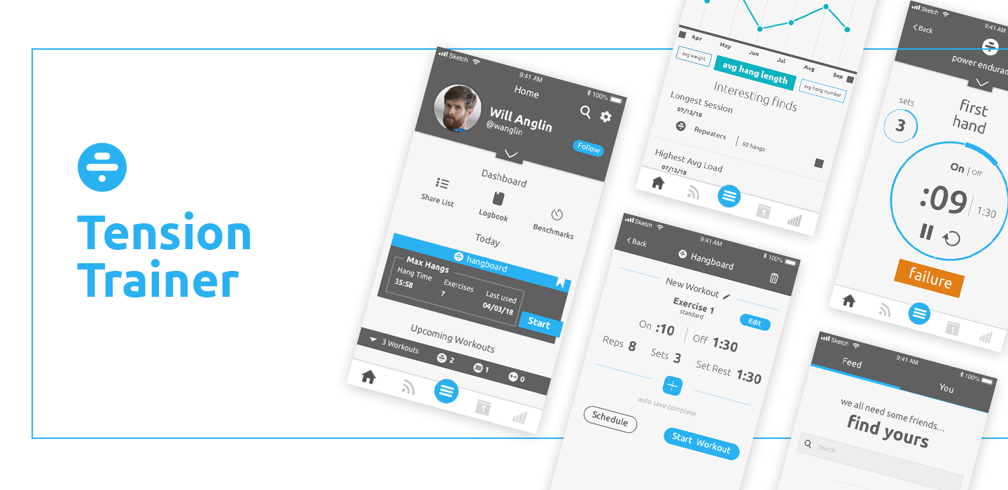
Tension Trainer App
Tension Trainer App
I originally built an app design for the General Assembly UX Course. My initial ideas caught the interest of a climbing hold company called Tension Climbing. We've since partnered up to design and develop a more fully featured climbing app. Here I will outline the process from initial idea (BetaBoard) that I built for my course through to where I'm at today with the Tension Climbing app.
BetaBoard UX Process
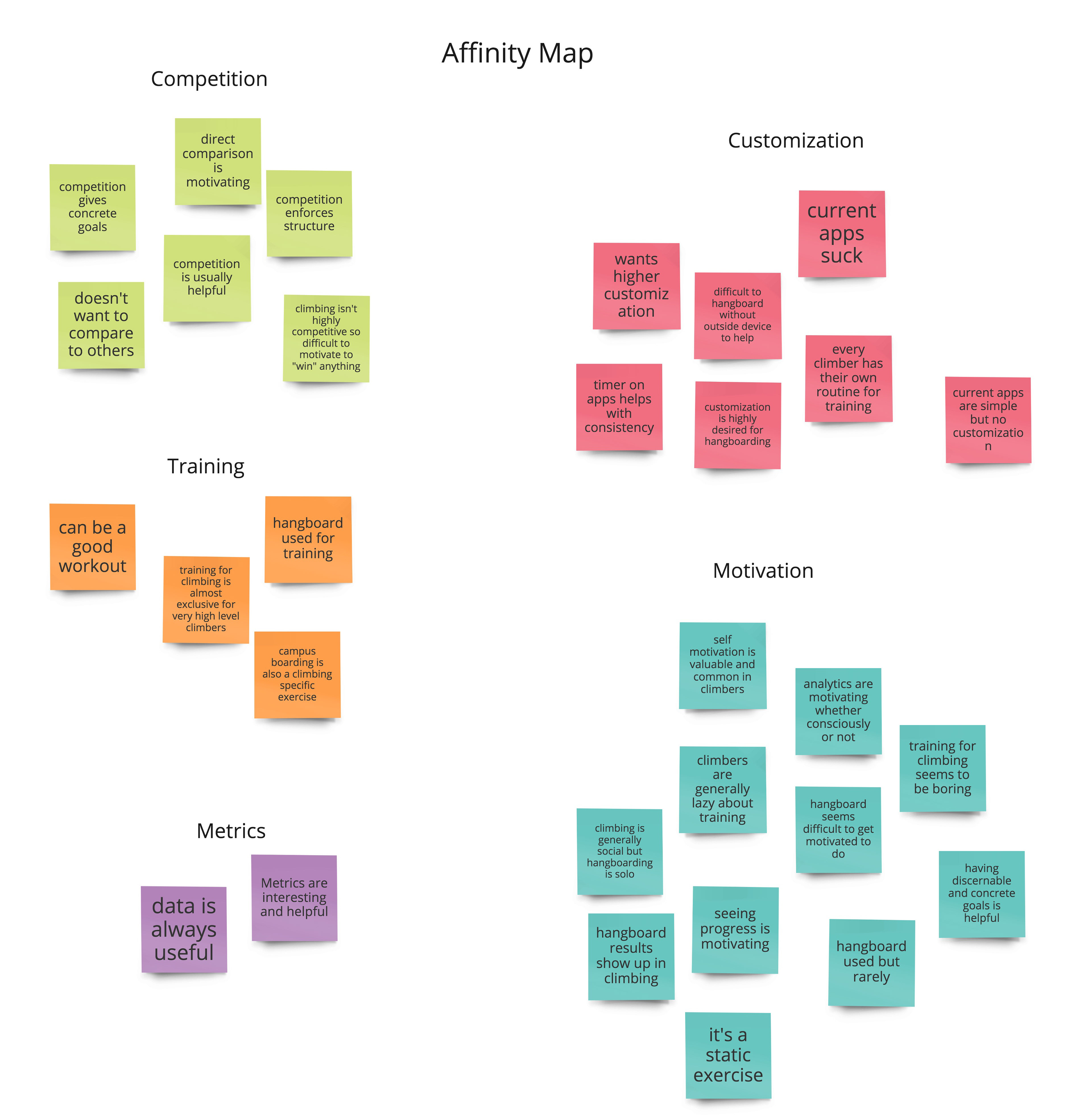
User Research
I conducted 4 user interviews and recorded them for later reference and note taking. The goal was to determine why climbers do/don't use a hang-board for training, why they do/don't use a hang-board app when training, and what other fitness apps they have experience with. I also wanted to determine what pain points users had with hang-board apps (hint: a lot) and what they liked and didn't like about other fitness apps. I tried to minimize any inquiry that would lead to users beginning to work on solutions for hang-board apps. Here you can see an Affinity Map I created based on the feedback I received from these user interviews.
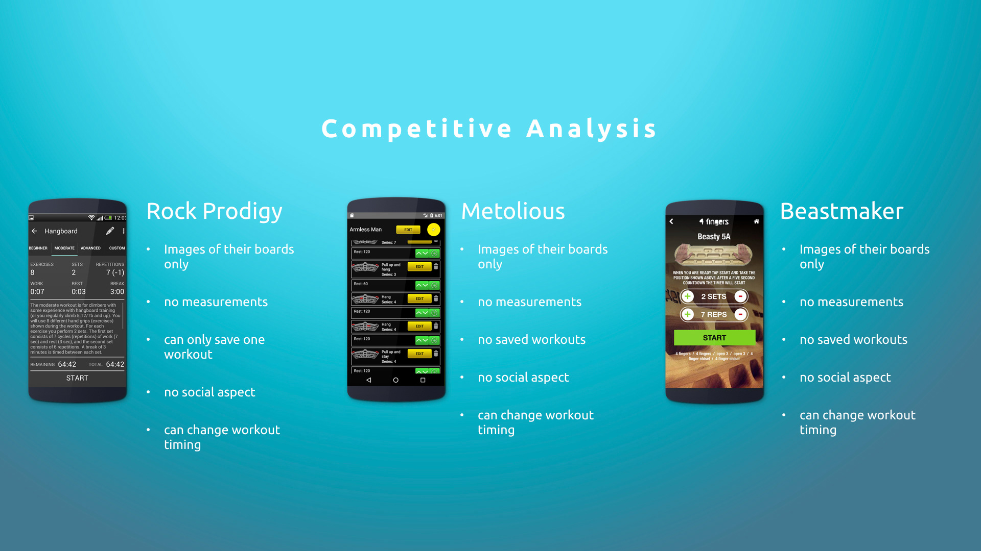
Competitive Analysis
In addition to user research, I also conducted competitive research to determine what other apps are already on the market and the features they have as well as the pros and cons of each one. I did this through a Competitive Analysis and a Pluses and Deltas Analysis. You can see screen grabs of both below but I will also link to them since it can be hard to see in just screen grabs.
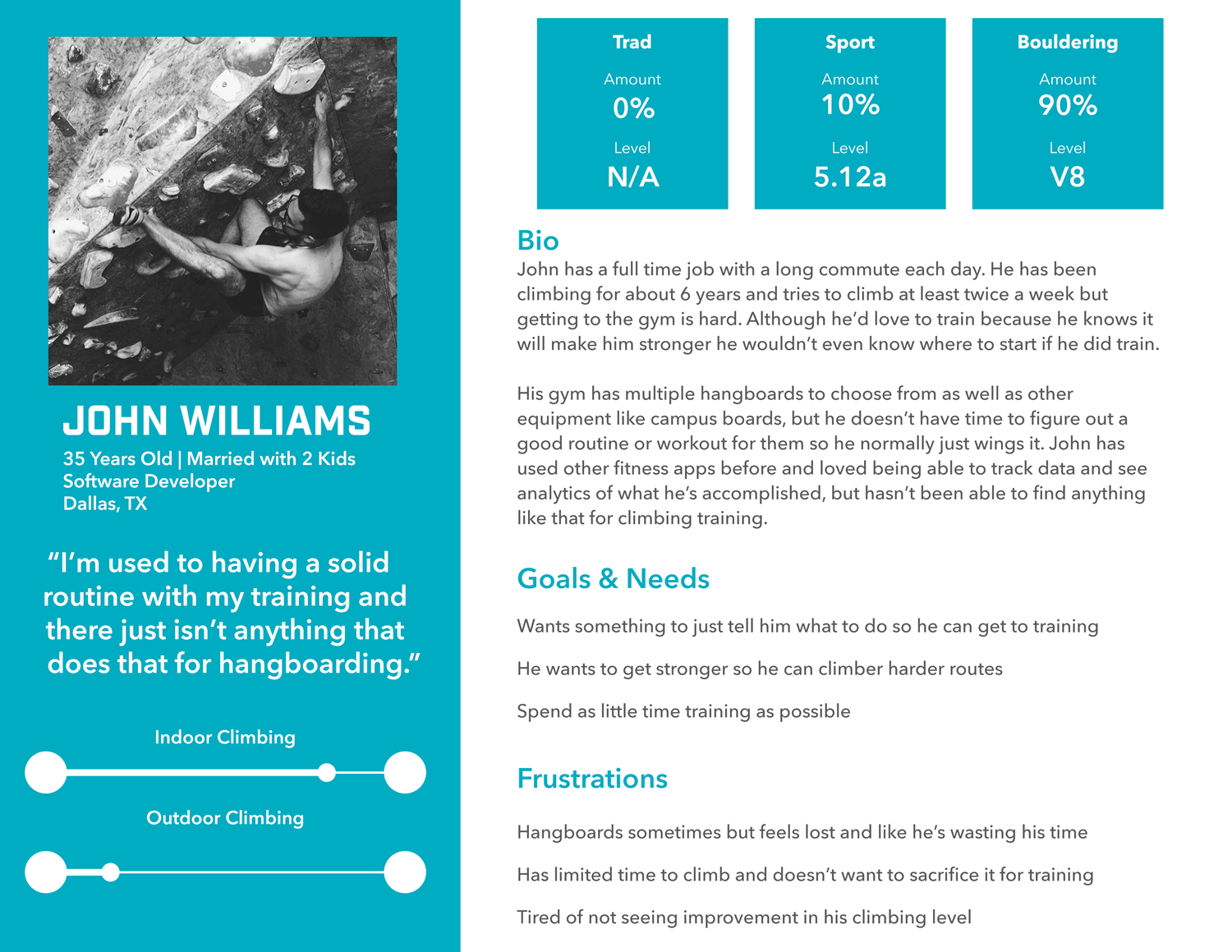
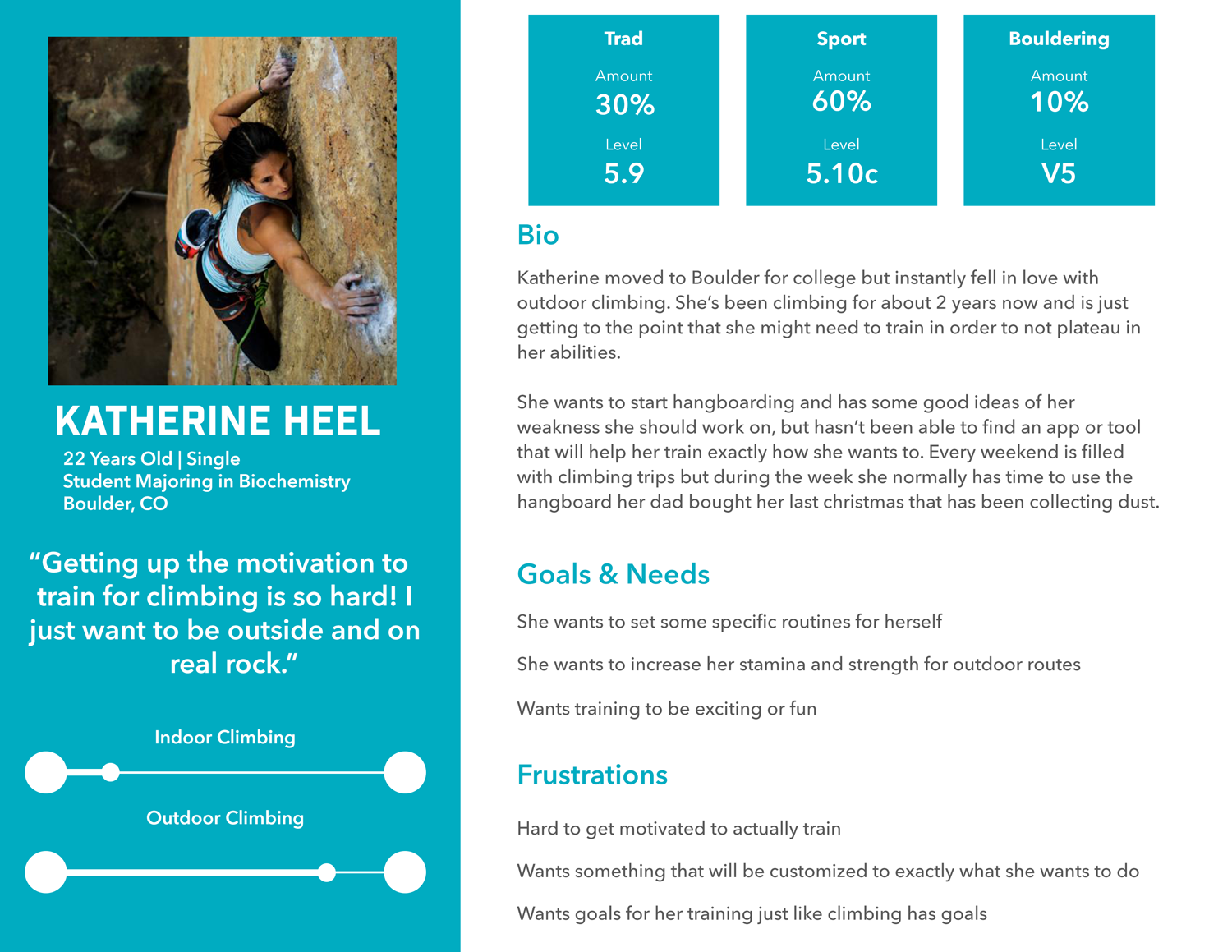
Personas and Problem Statements
Personas were a ton of fun to make. It was interesting to try and consolidate the research information to determine the true needs of the users, and then create personas that would create empathy and show specific situations those needs would be found in. I was only supposed to create one persona but I felt like at least two were needed to accurately depict most of the needs of the users.
Based on these personas I created several problem statements to guide me.
Problem statement #1: John needs a way to optimize his workout routines because he has limited time to do them.
Problem statement #2: Katherine needs a way to be motivated to hang-board train more often because she finds it boring and difficult to plan.
Problem Statement #3: John needs a way to see and track progress in his training because if he has to train he wants to make sure it's making a difference.
Problem Statement #4: Katherine needs a way to customize training because she wants to train exactly what she wants.
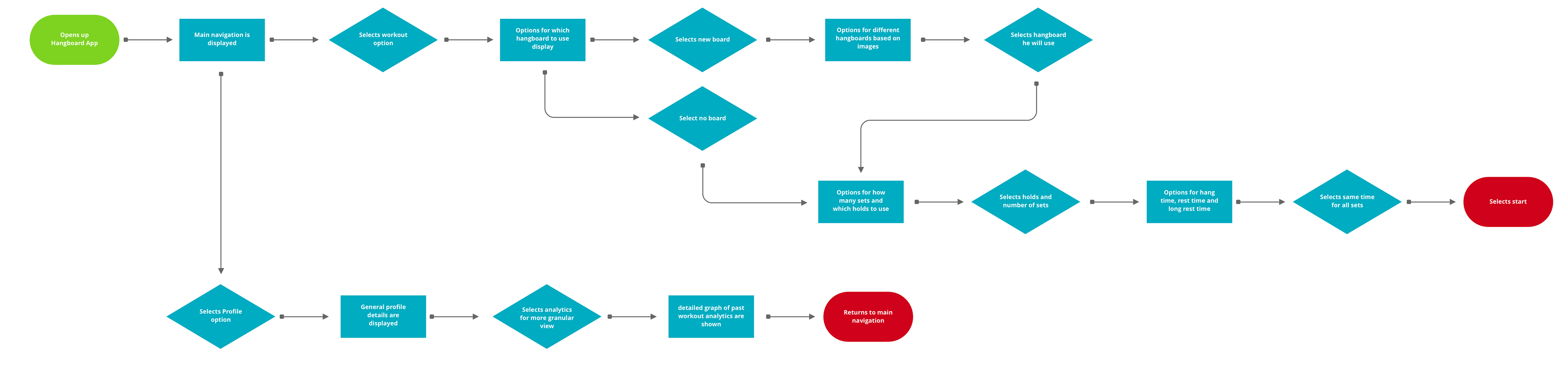
User Flow
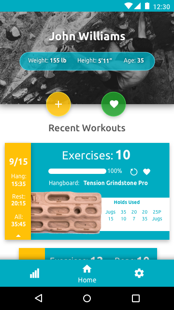
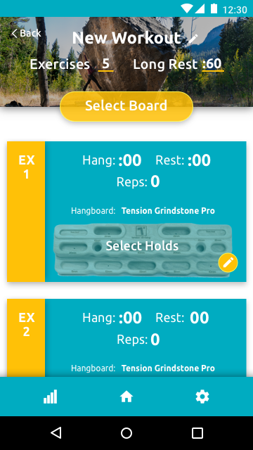
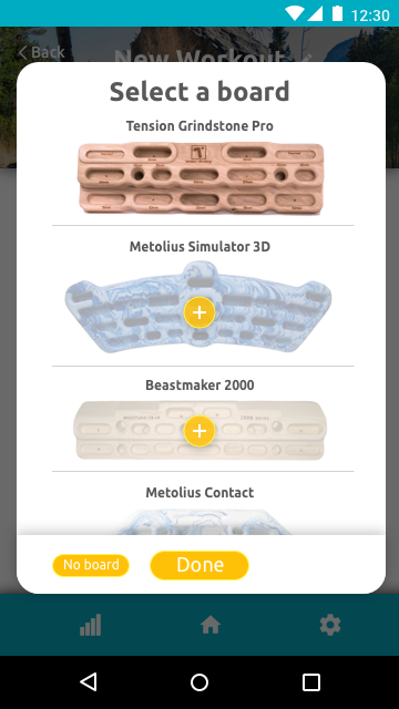
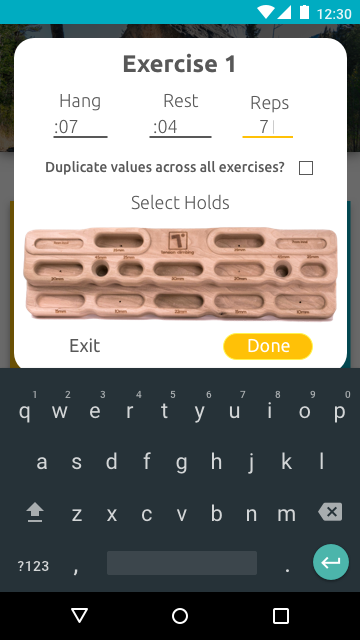
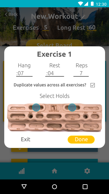
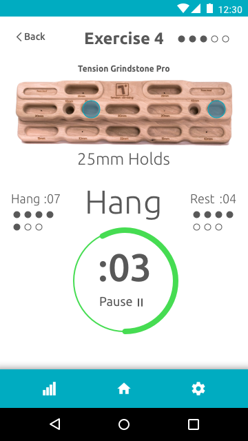
The next step was to set up a user flow based on what would be the primary use case as shown from the personas created. (Many of the problem statements are useful but do not necessarily apply to the MVP. I first need to create an MVP before I can address some of the other problem statements created from the research.) Clearly, since this app is to assist with hang-board training the main use case would be to, you know, use it to train on a hang-board. The main difference between this app and the other ones out in the market now is this one will allow for selecting specific holds on a hang-board so you can customize and setup sessions more easily. I also want to implement analytics like other exercise apps do so users can see the progress they are making and are encouraged by that.
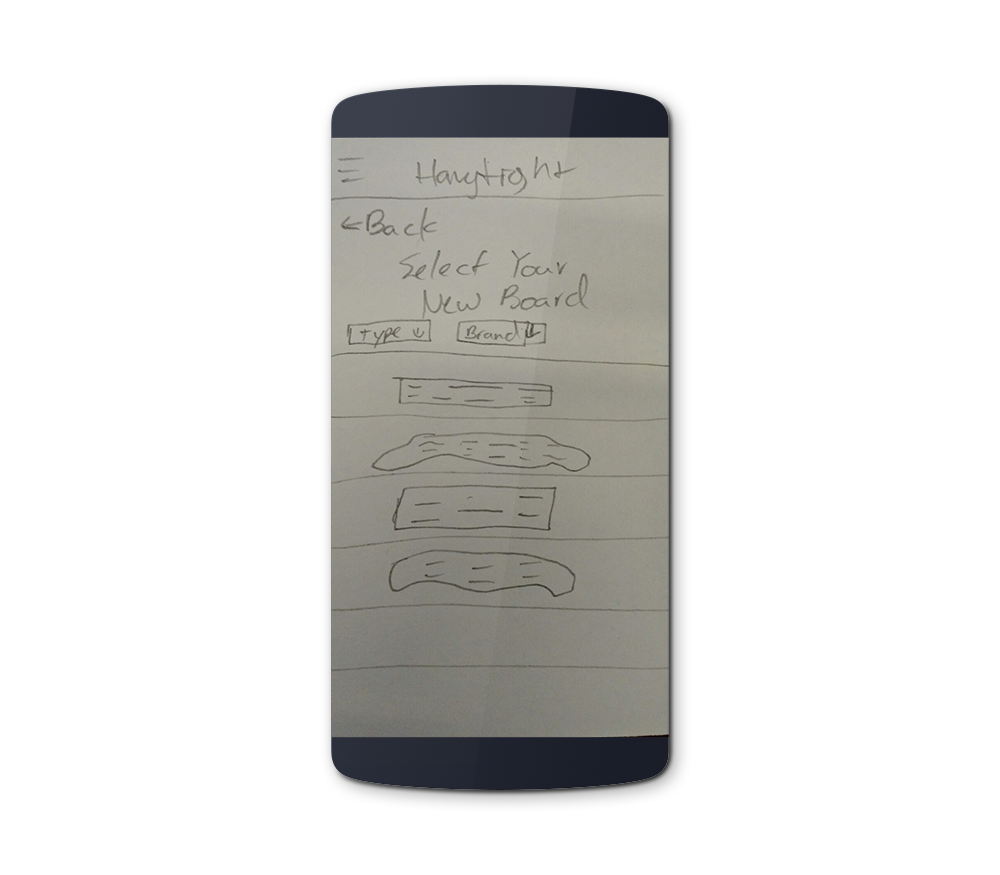
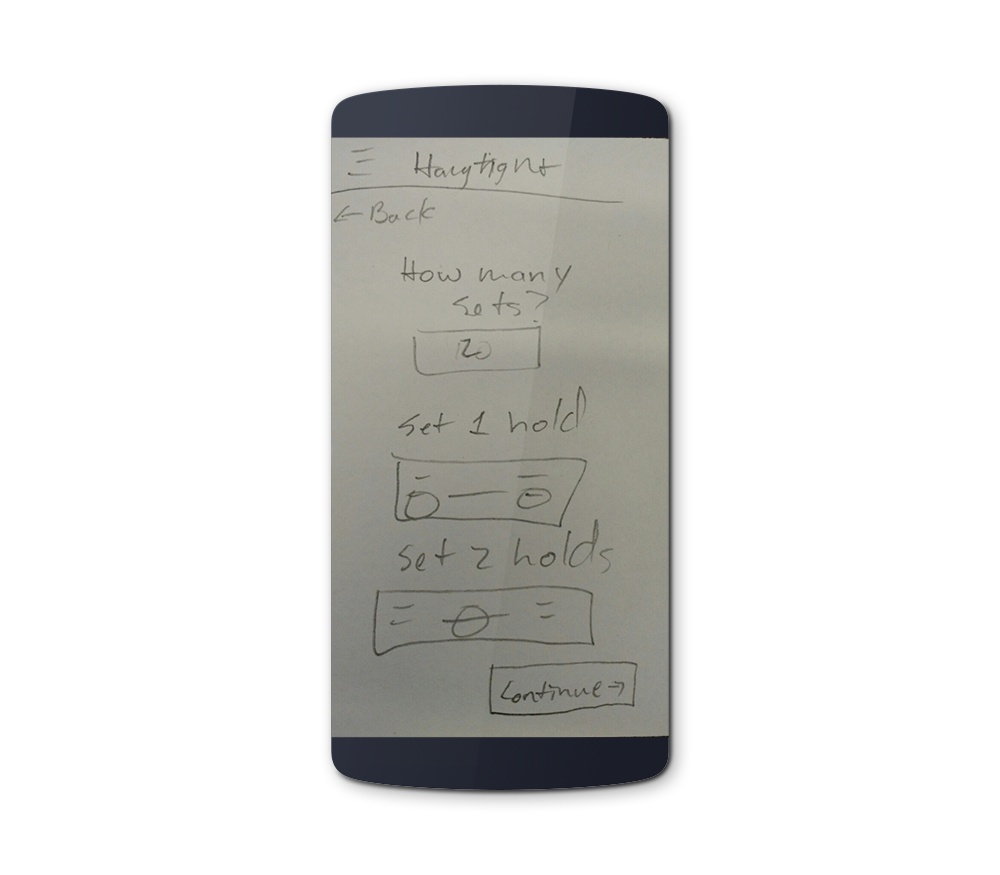
Paper Prototyping
I created paper prototypes next based on the user flow for users to try out. I used the Marvel app so users could get a better feel of what it might be like on their phone.
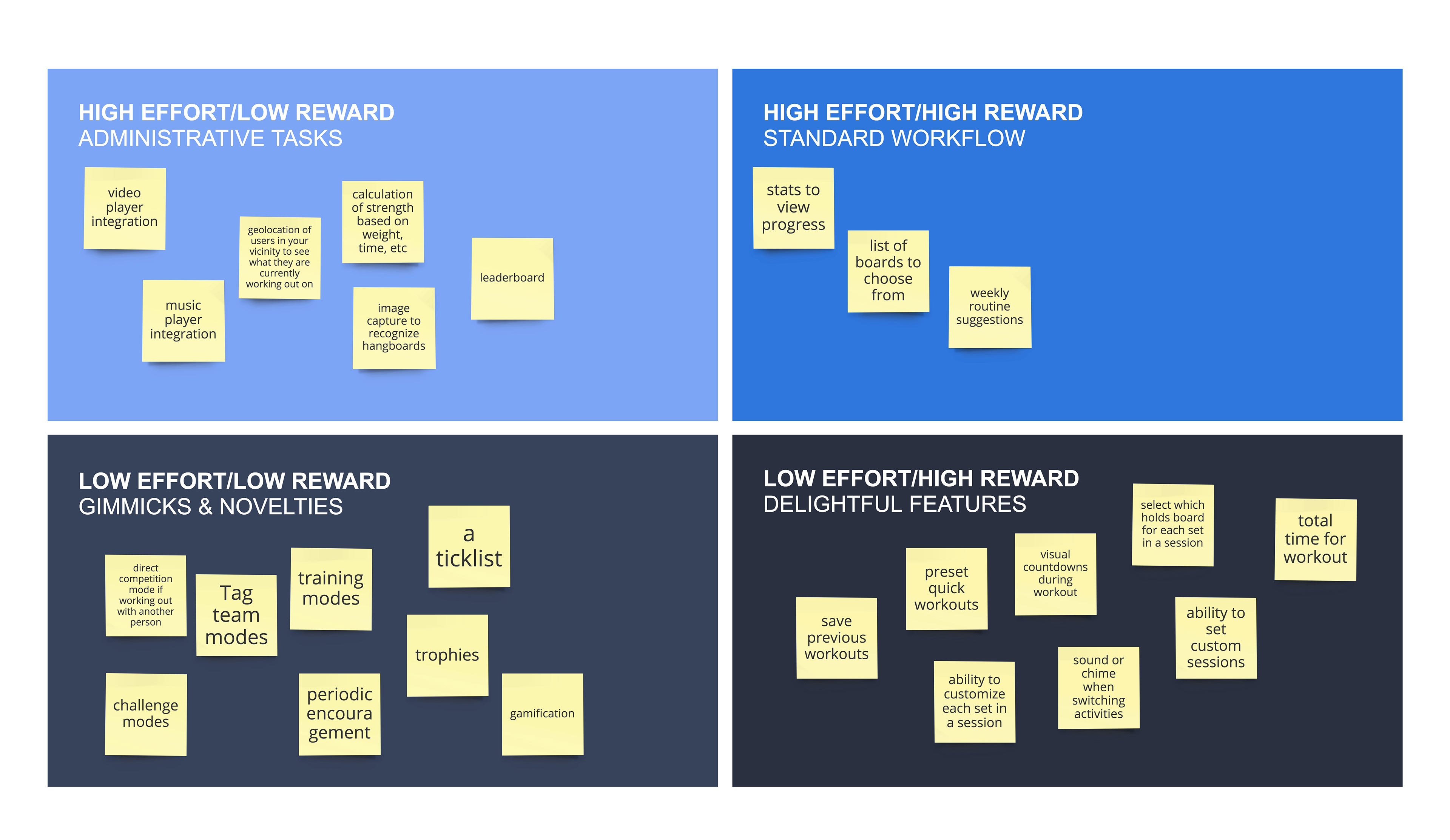
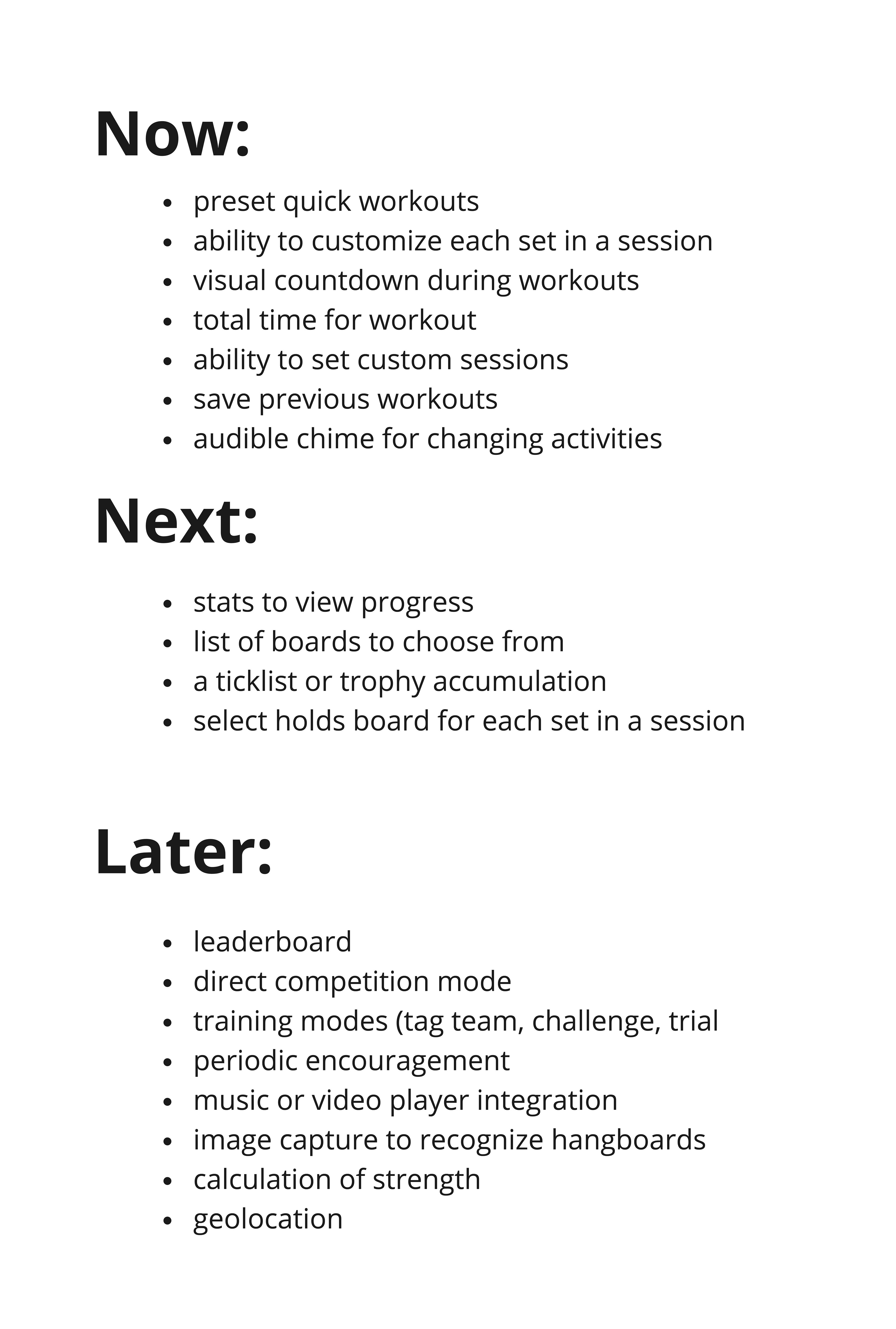
Feature Prioritization
The next step is to brainstorm as many features as I can and then use systems to prioritize them. I decided to use the 2x2 Matrix and the Now, Next, Later methods to help me prioritize. These helped me narrow down what would be in the MVP and what would be awesome things to add afterward. Below you can see the paper prototype. The prompt was the setup a new workout using a new hang-board with 3 sets.
Wireframing
Next I worked on wireframing some of the key pages that will be needed in the app to help think through not only general design, but also some of the IA and how that will be communicated to the user as they use the app.
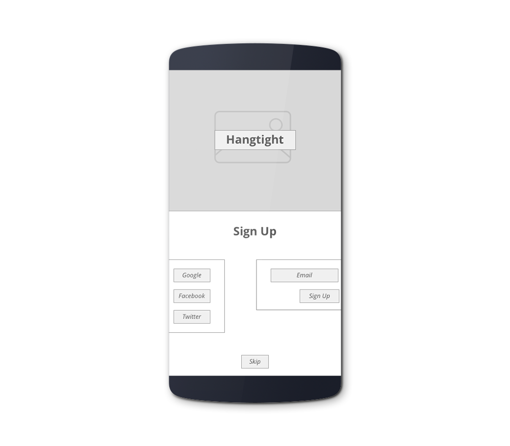
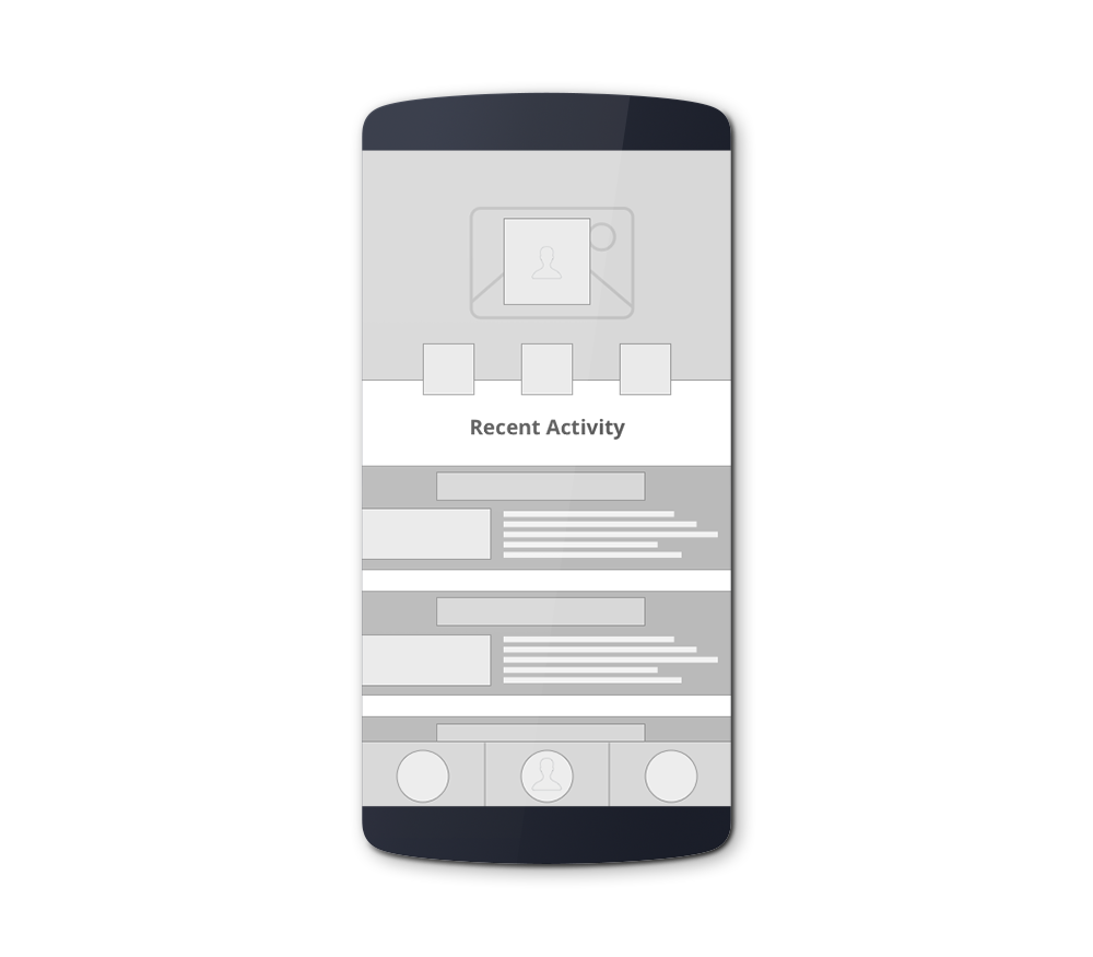
HiFi Prototyping
Using Information Architecture and Card Sorting I began developing HiFi prototypes so I could begin user testing using InVision. I will include more images below but there are many more that I developed. I've also included a link to my presentation slides I made for the end of the course.
Tension Trainer UX and Design Process
Once I had most of the process figured out through the BetaBoard app I was able to go a bit more immediately into some design prototyping. However, I still needed to do a bit of additional UX work before I started that
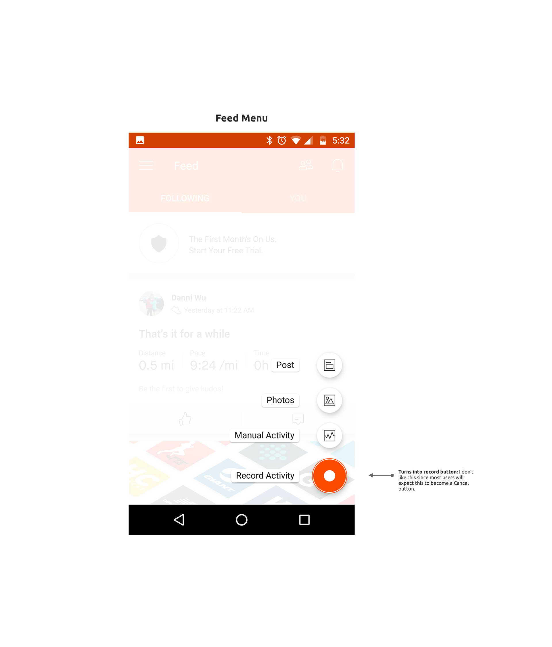
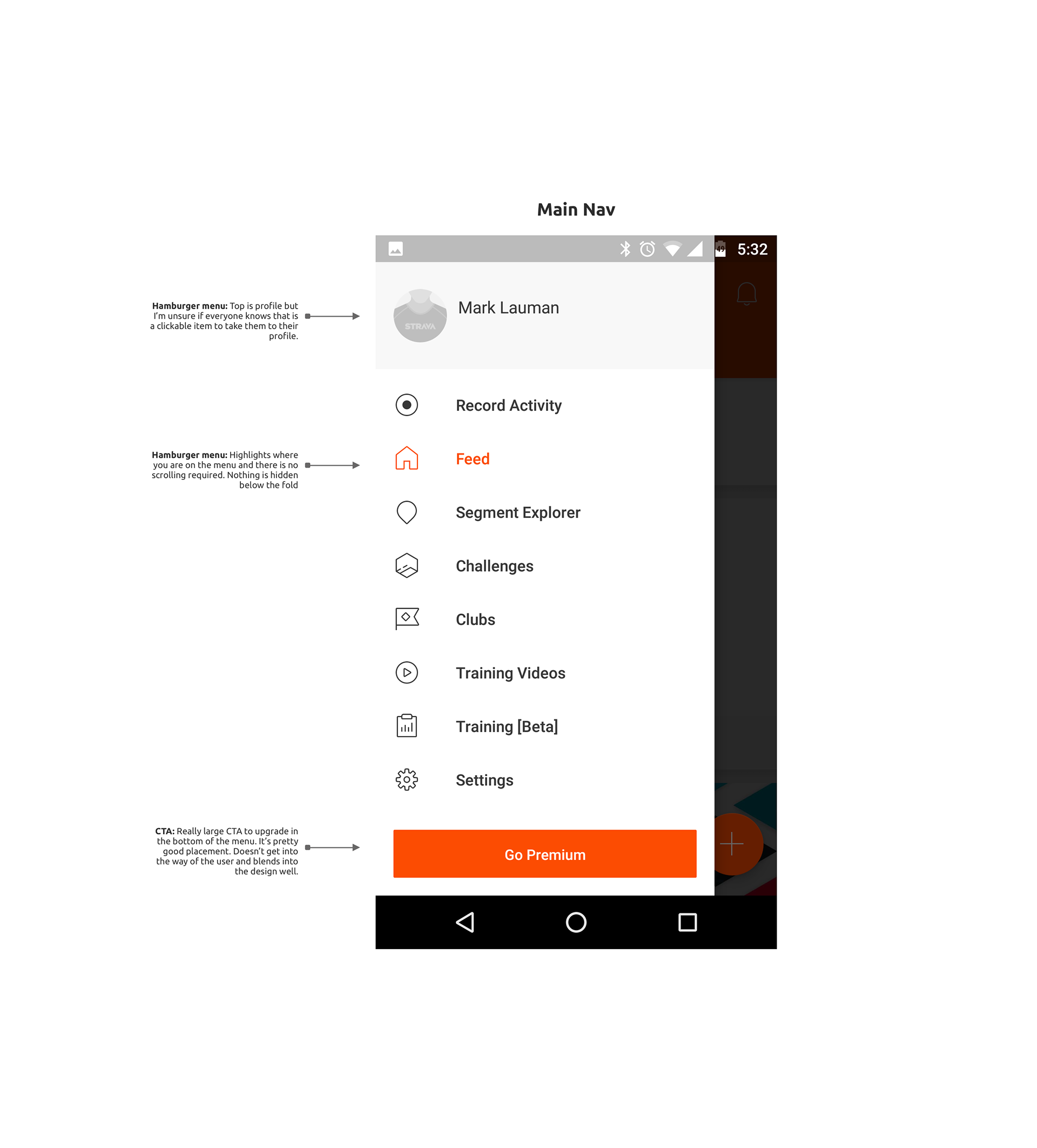
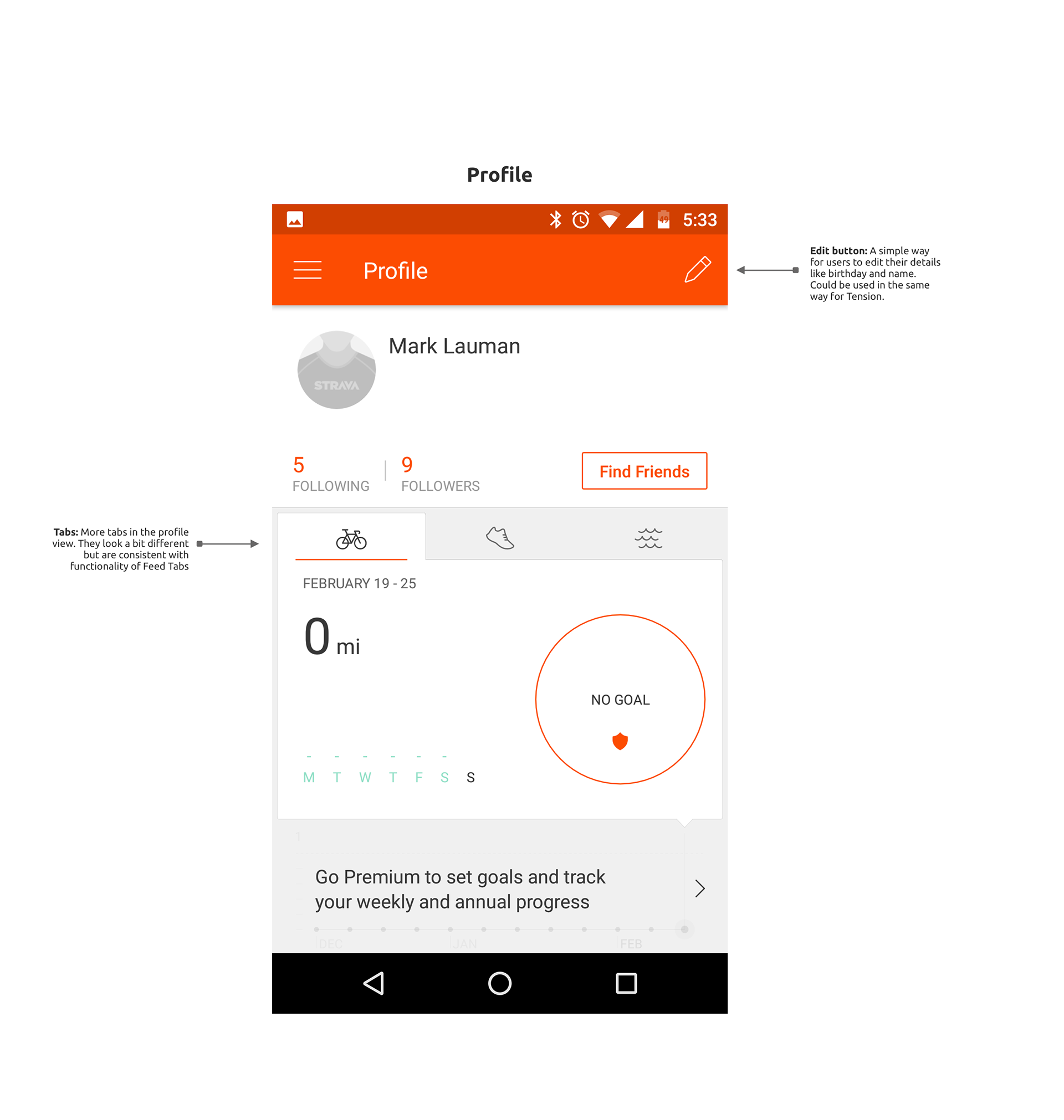
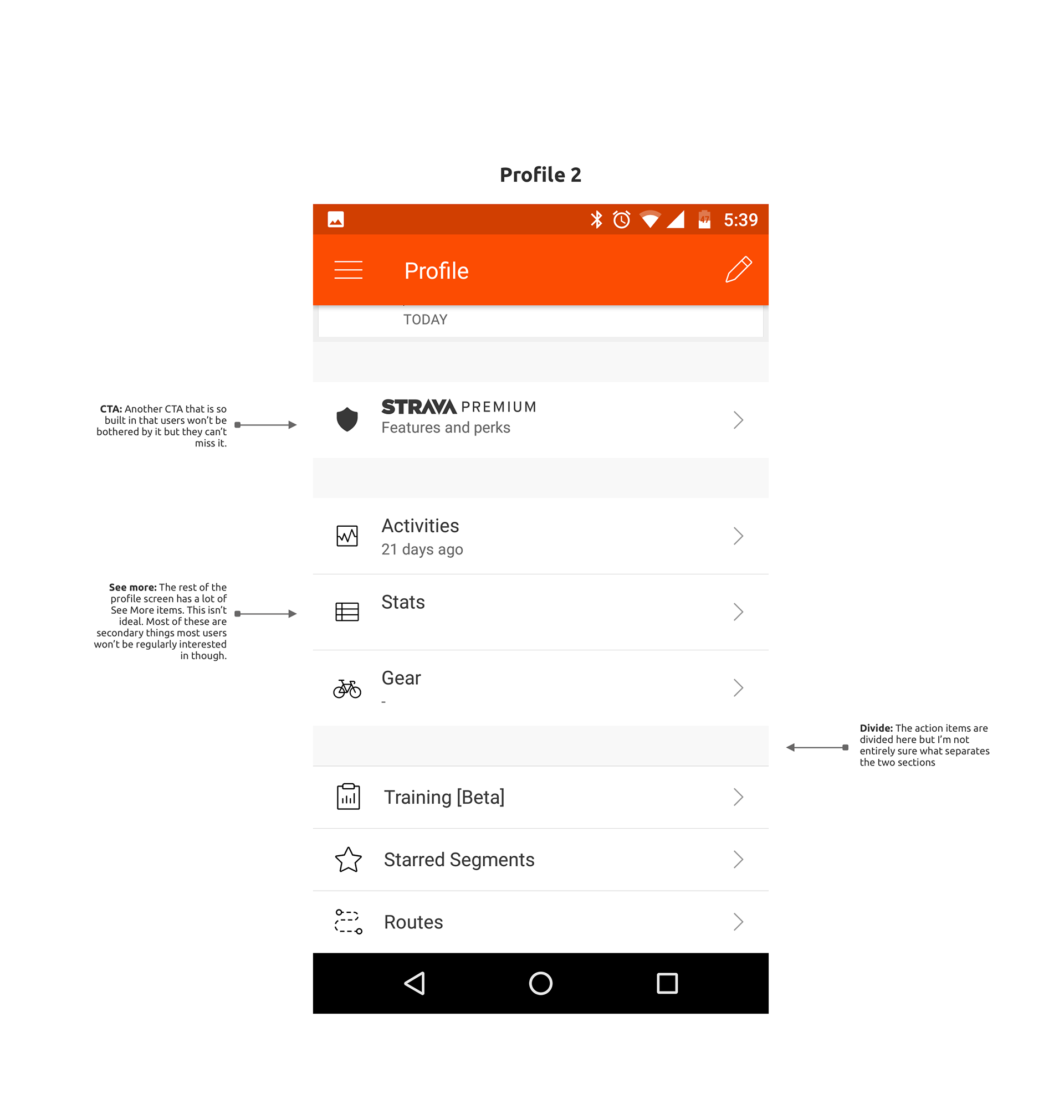
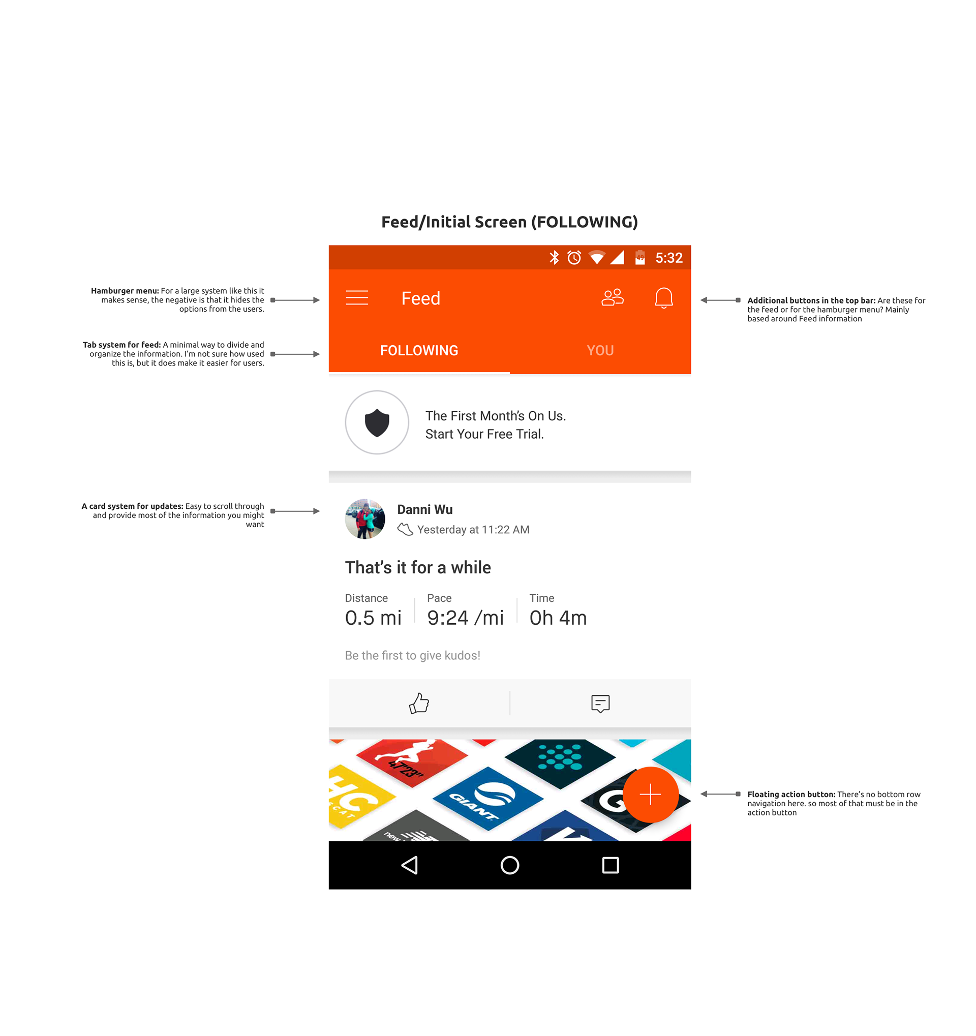
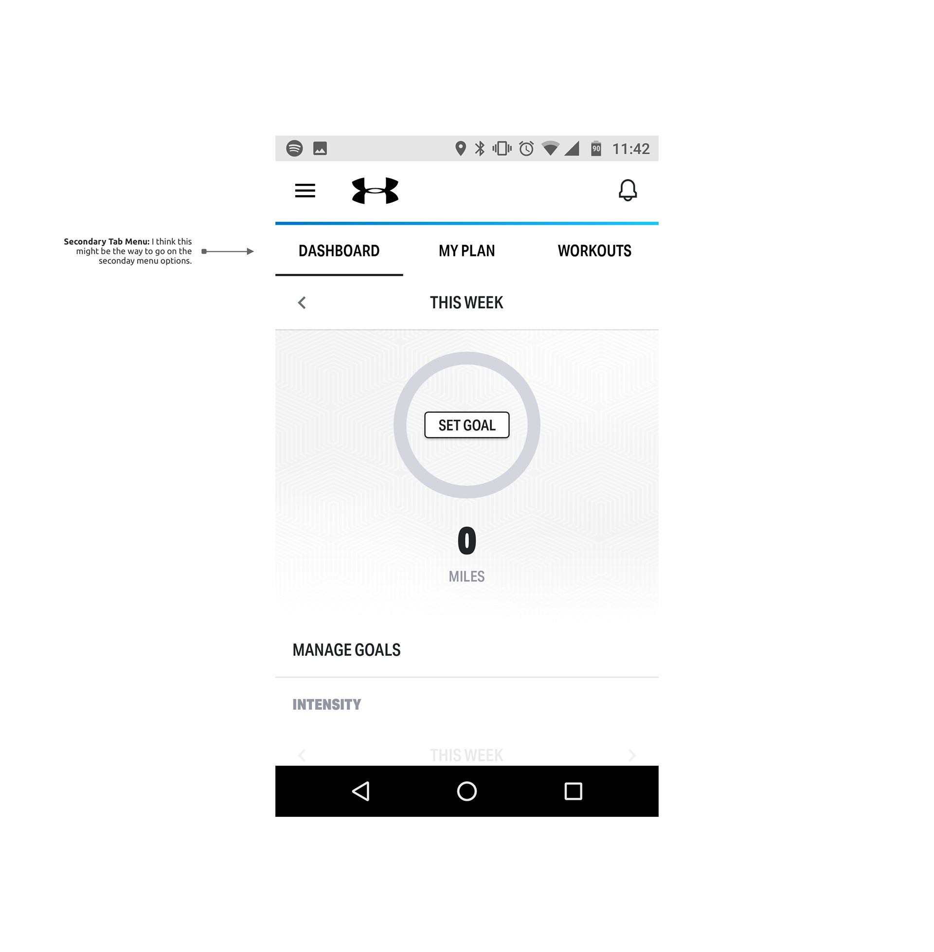
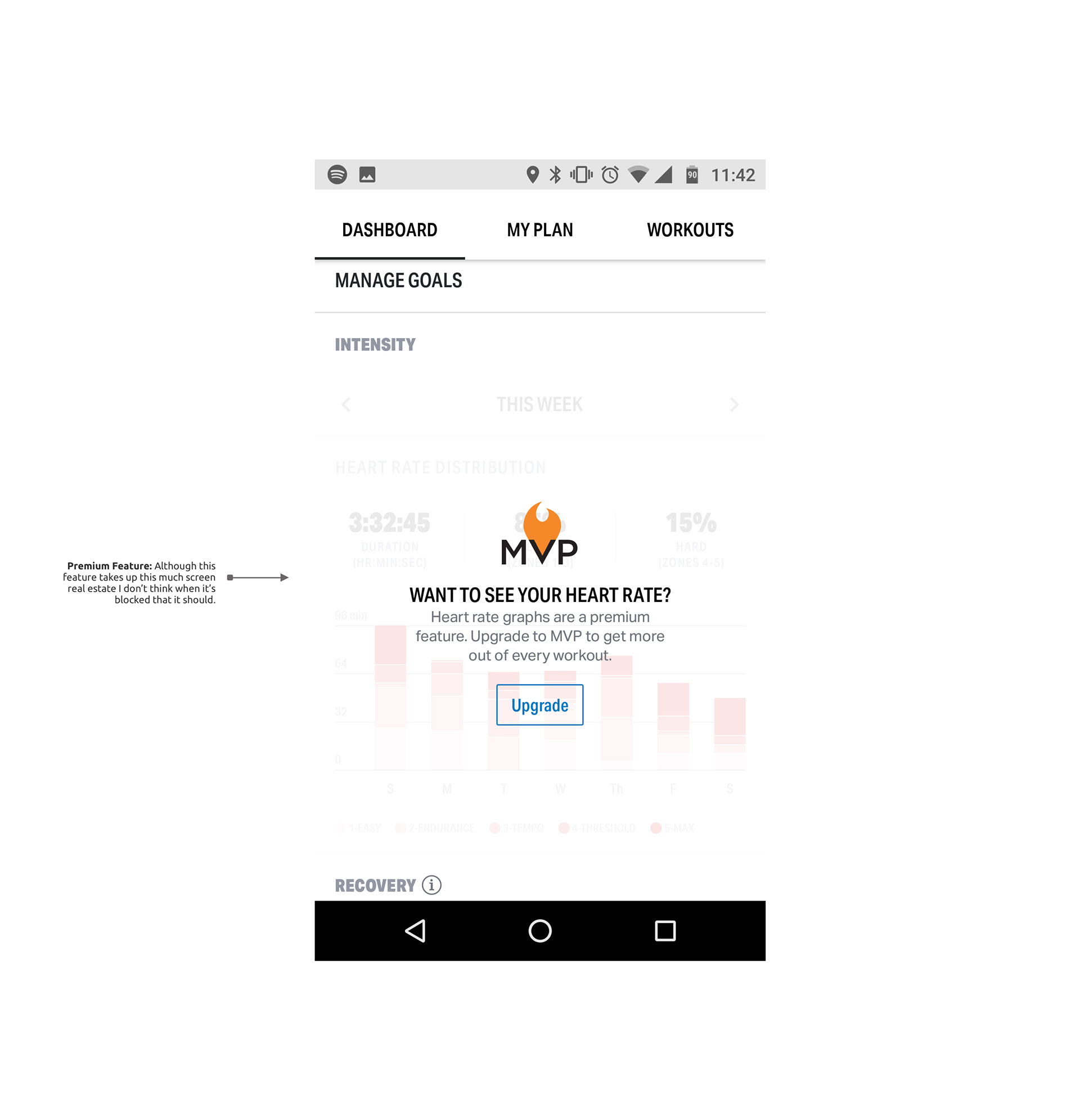
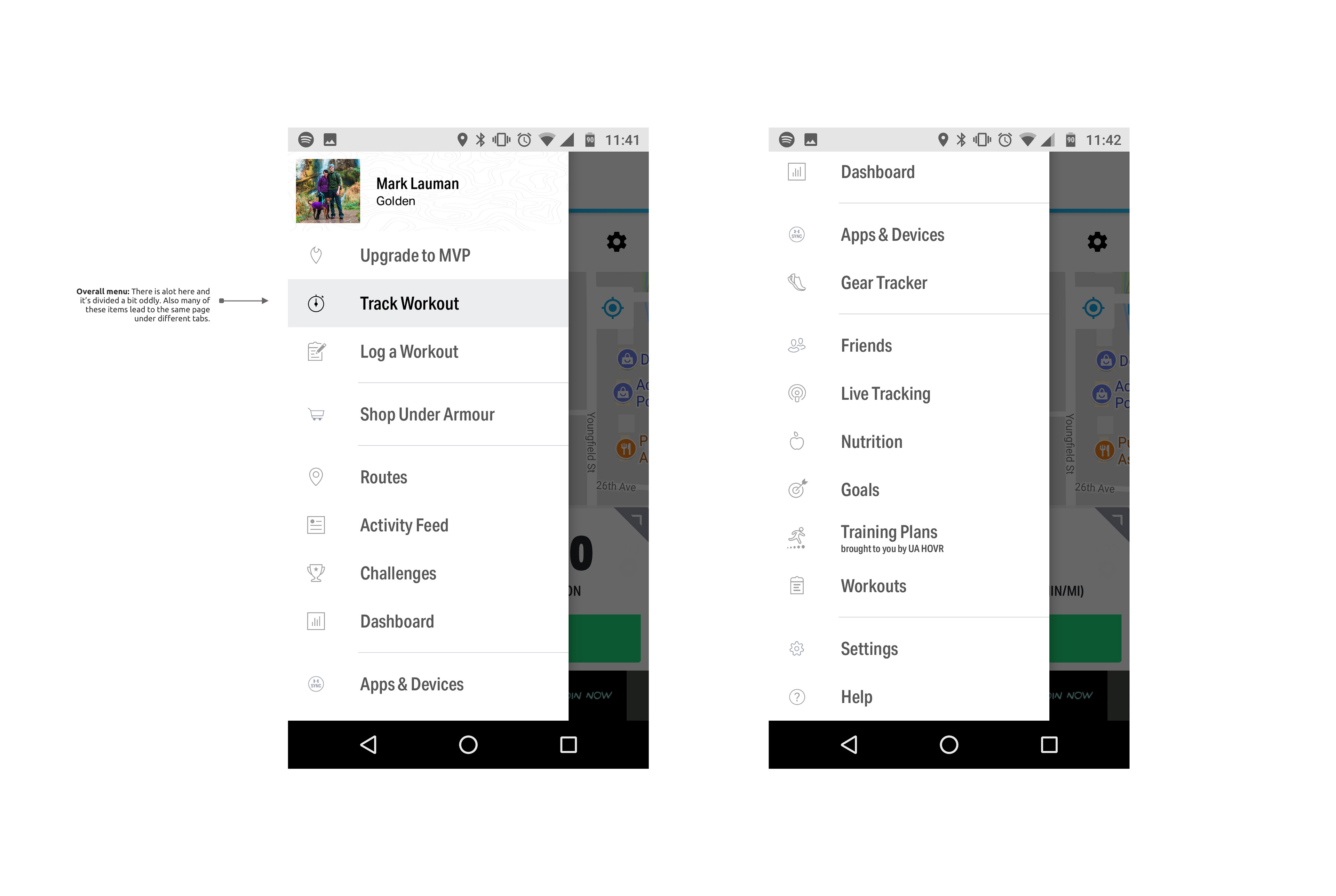
Competitive Analysis
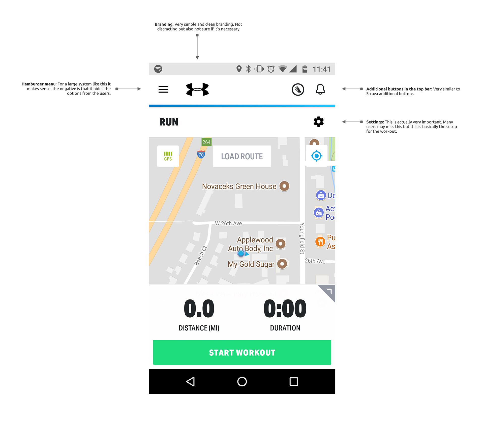
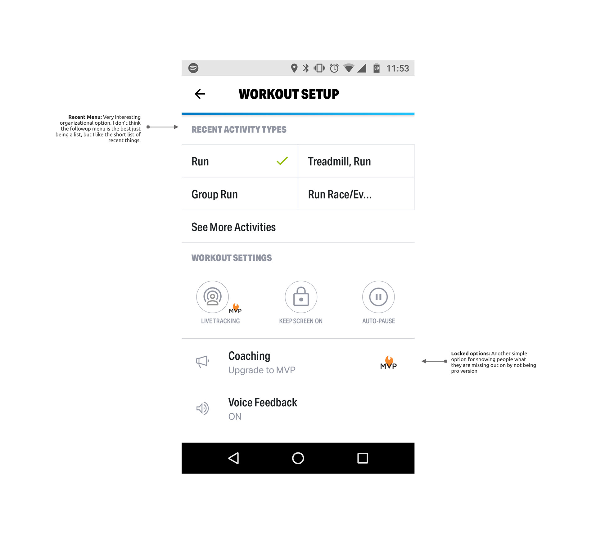
I began by doing some additional competitive analysis on arguably the top training apps on the market today, Strava and Map My Run. This helped the developer and I settle on some initial direction and get some ideas to begin playing around with.
Initial Drafts
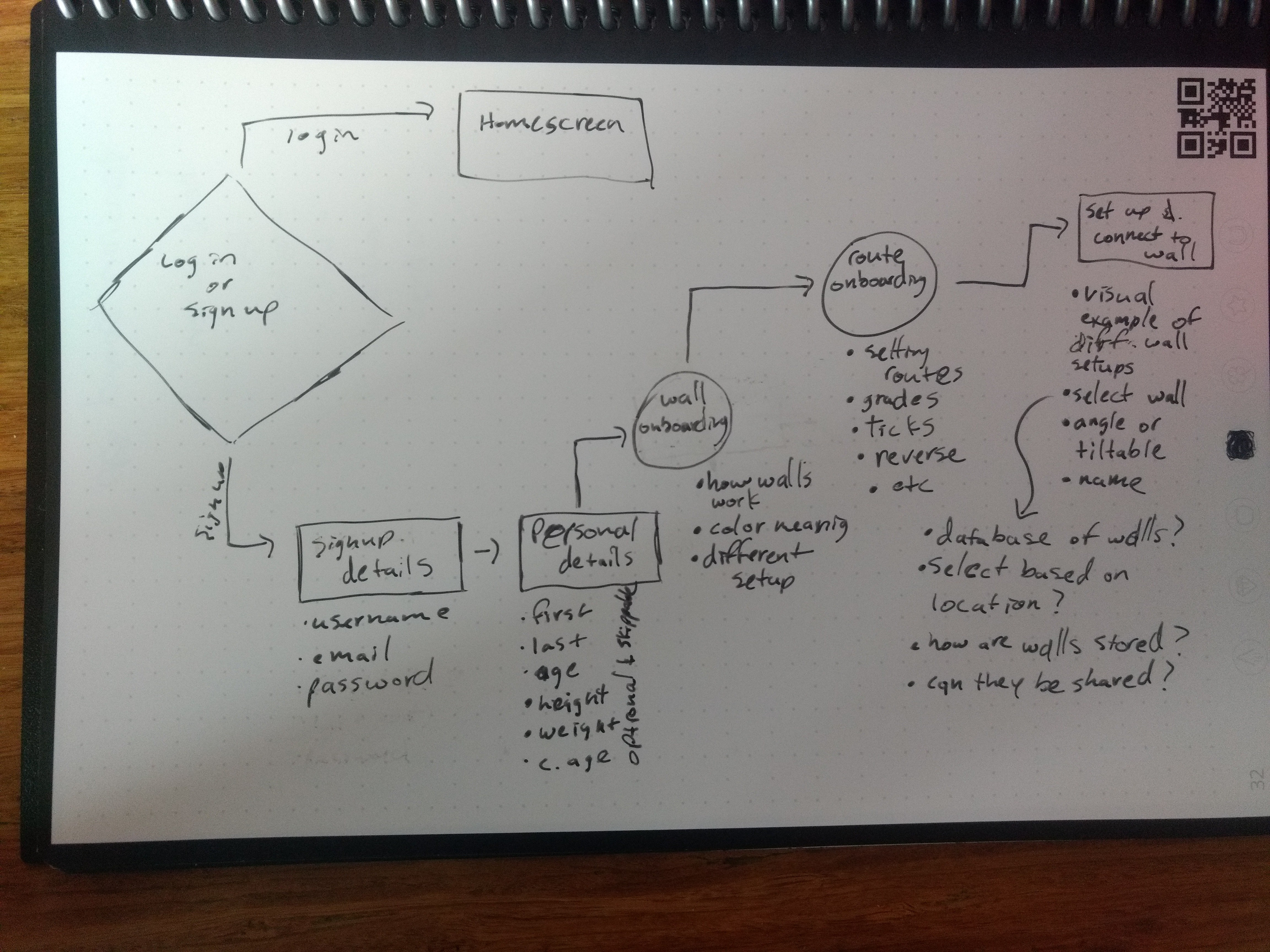
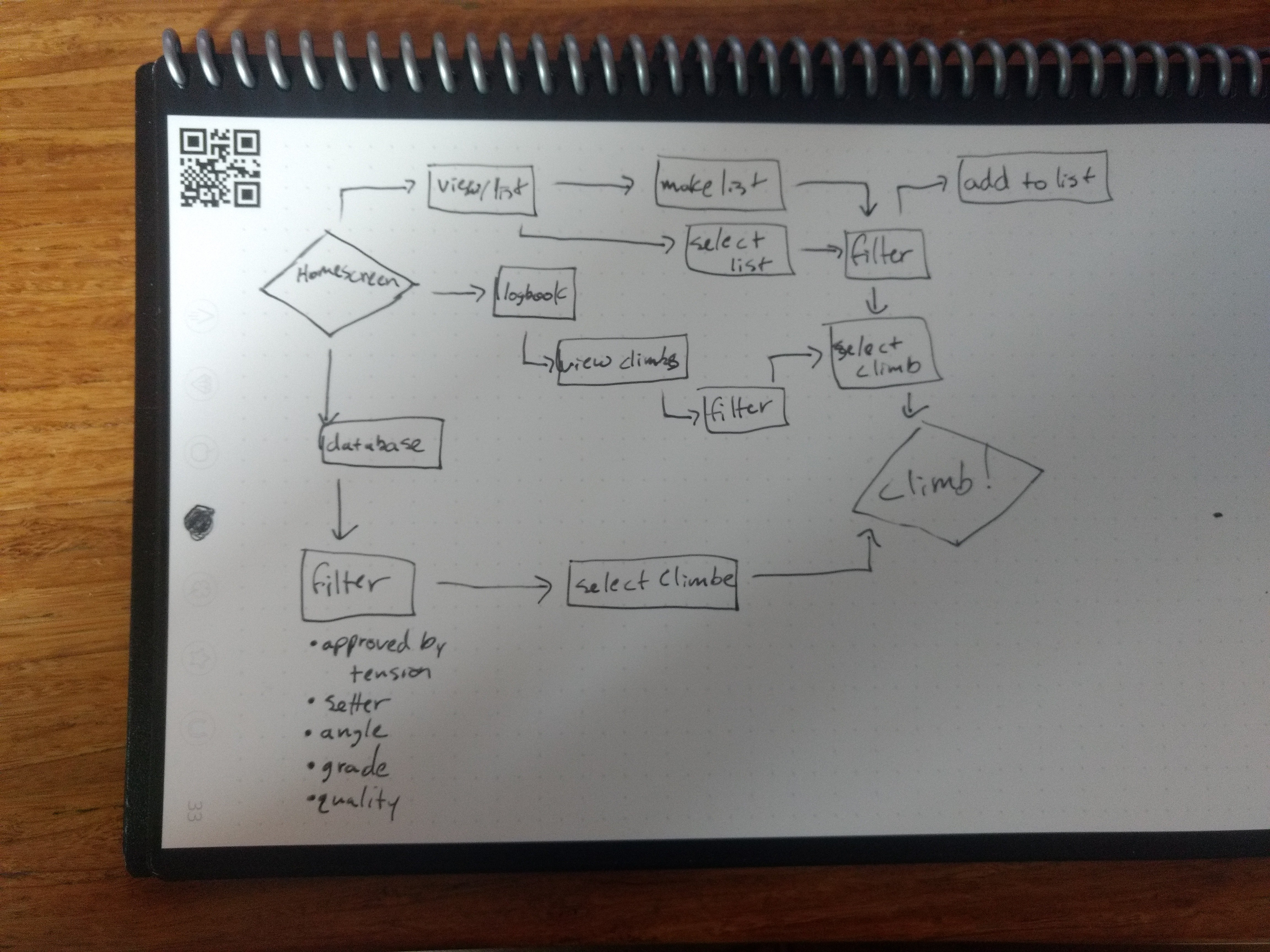
We mapped out some userflows and then jumped into some prototypes
Ultimately we decided these drafts were a bit too confusing and busy
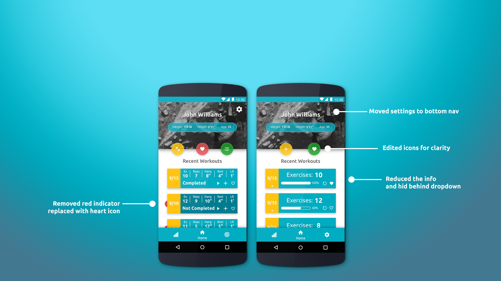
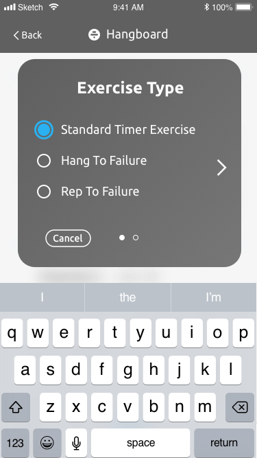
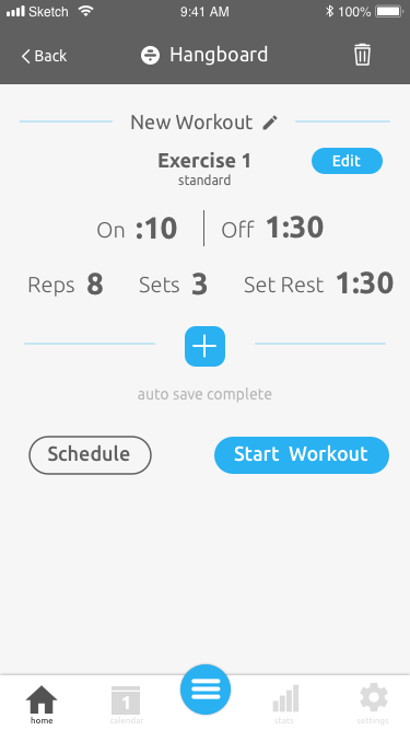
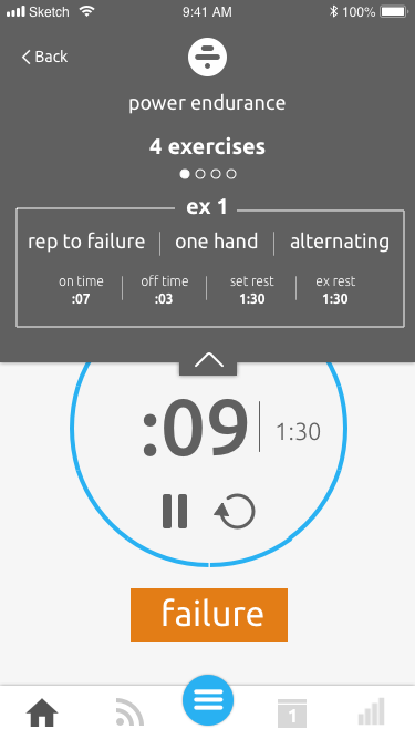
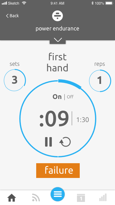
Continual Iteration
None of those designs were necessarily very good and we've continued to iterate based on user feedback. Soon we will be launching an alpha and be gathering further feedback to help us continue to refine the experience as we continue to expand the functionality and usability of the app as a whole.
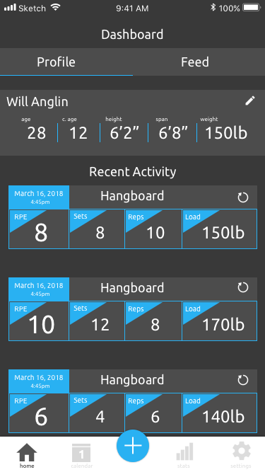
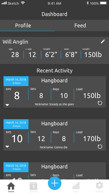
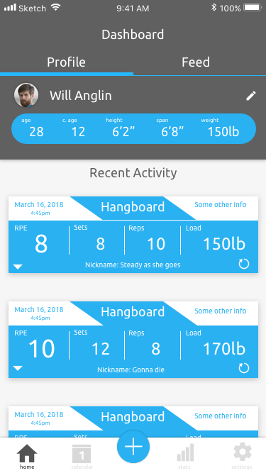
Profile
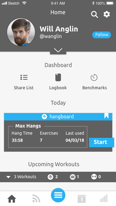
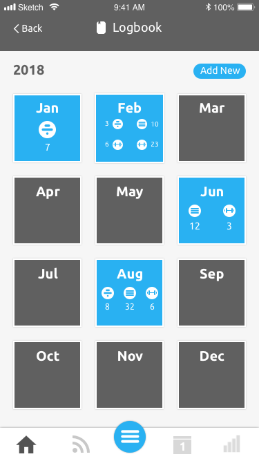
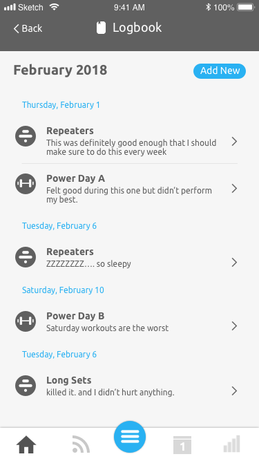
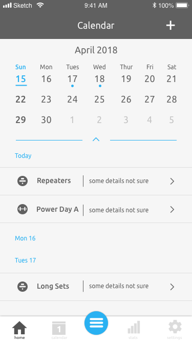
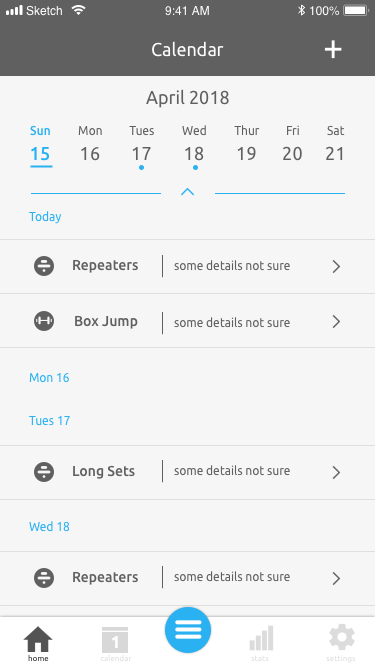
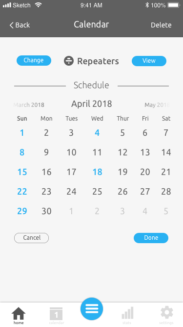
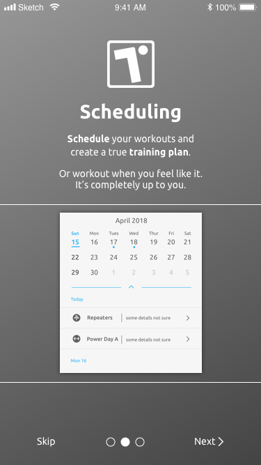
Calendar
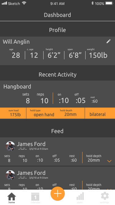
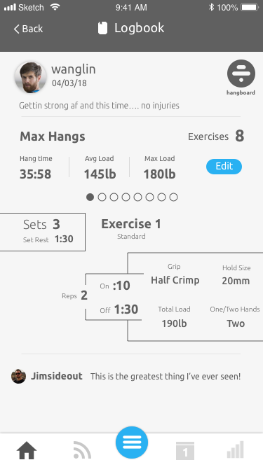
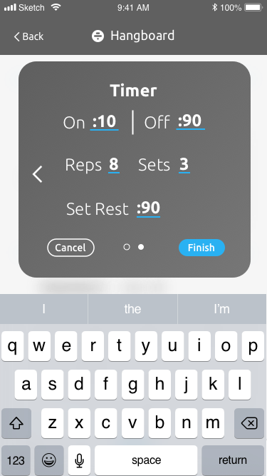
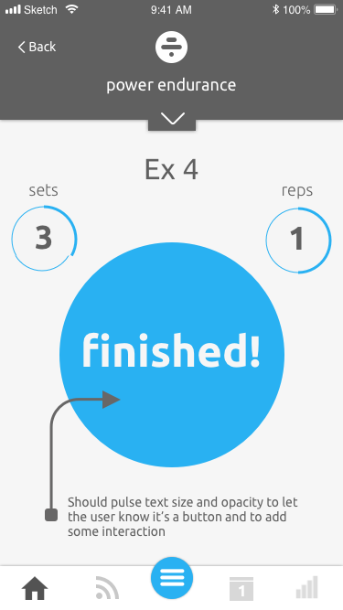
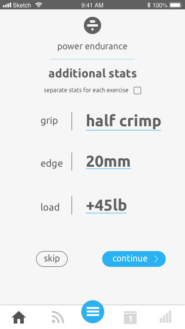
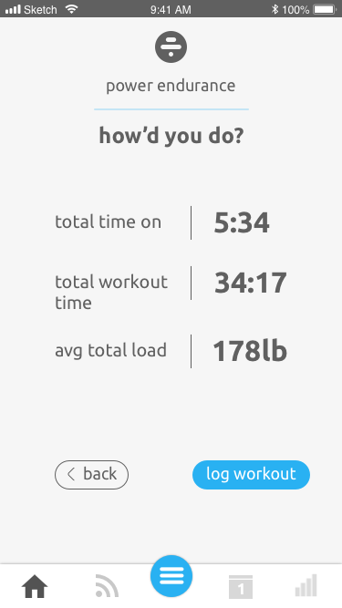
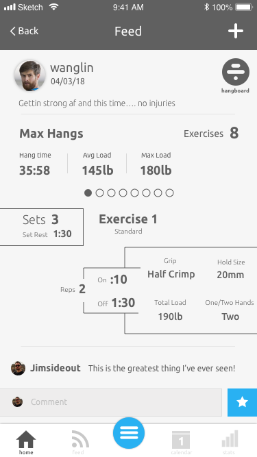
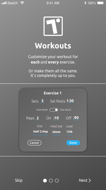
Exercise
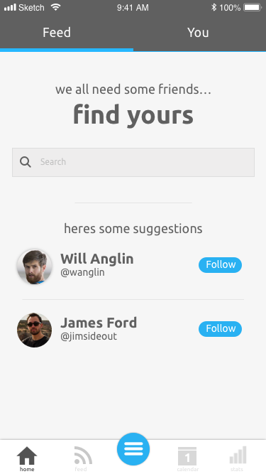
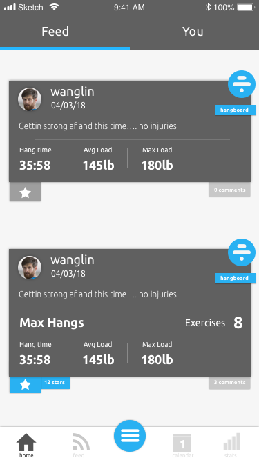
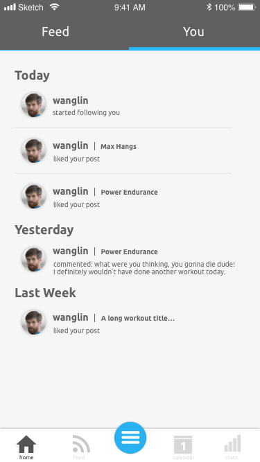
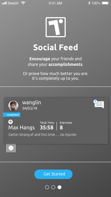
Social
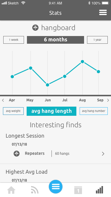
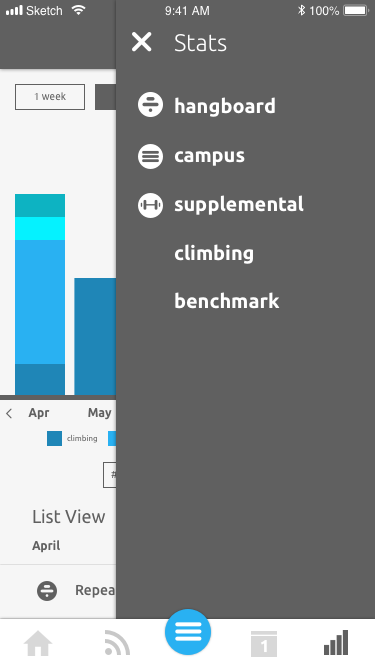
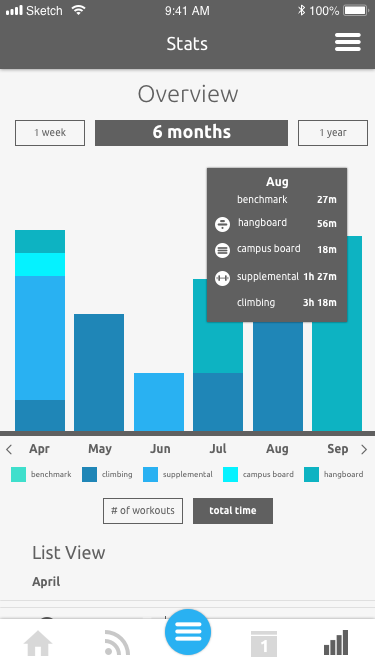
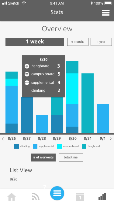
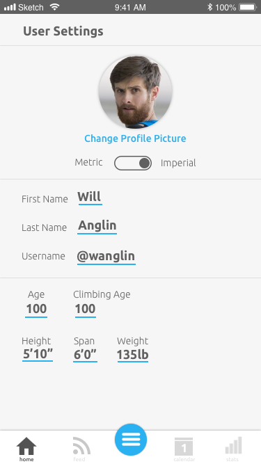
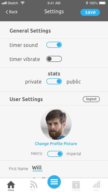
Stats and Settings
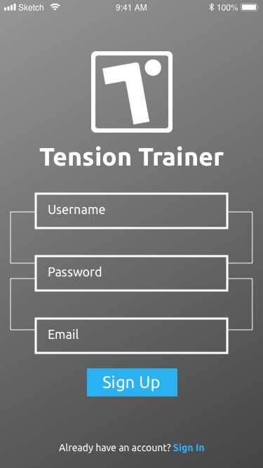
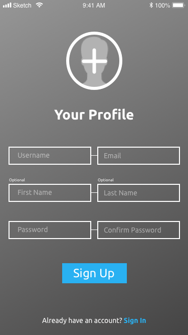
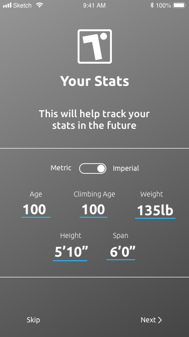
On-boarding and Login
Conclusion
Tension Trainer is still in development.